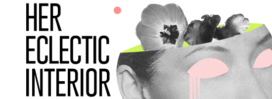
Hemos agregado una nueva sección en el blog donde hablaremos de arte y diseño de interiores. Para esta primera ocasión nos acompaña nuestra querida amiga Eileen Beato, ella es la brillante persona detrás del blog HER ECLECTIC INTERIOR, como diseñadora de interiores y de luces nos trae ideas frescas a la hora de renovar tu hogar. ¡Esperamos que le guste!
We have new section on the blog where we will talk about art and interior design. Today we share this space with our dear friend Eileen Beato, she is the person behind the brilliant blog HER ECLECTIC INTERIOR, as an interior and lighting designer she brings fresh ideas for your home and spaces. Hope you like it!
Xoxo. Mariela & Nathalia.

Cuando vi la colección Folkcolor de Ela no pude evitar sentirme inspirada. No es ningún secreto que el color puede hacer que nos veamos bien o romper un diseño en pedazos. Por suerte, solo es encontrar la paleta de colores perfecta .
Cuando el color es el adecuado se puede:
- Mejorar la salud y el bienestar
- Modificar la temperatura percibida – se puede hacer que el espacio sea más cálido o más frío
- Transformar espacio percibido – el color puede ayudar a cambiar la percepción del espacio, a que se sienta más grande, o más íntimo y acogedor.
Lo cierto es que la psicología del color es un debate eterno en todos los campos del diseño pero con suerte para eso estoy yo, para ayudarte a encontrar el más adecuado para ti a través de estos increíbles sets de interiores y mis piezas favoritas de nueva colección Ela.
When I saw Ela’s Folkcolor collection I couldn’t help feel inspired. It’s no secret that color can either make you look good or break a design, but luckily, neither is finding out how to choose the perfect color palette for you. Colors, like feature, follow changes of emotions.
When the color is right it can:
- Enhance health, wellness or features
- Modify perceived temperature: makes your space feel warmer or cooler
- Transform perceived space — make your space feel larger, or more cozy and intimate
But it has to be the right color for you. The true is that the psychology of color is a timeless theme in every design field. So, let me help you choose which one could be the right one through these amazing sets and my favorite pieces from newest Ela’s collection.
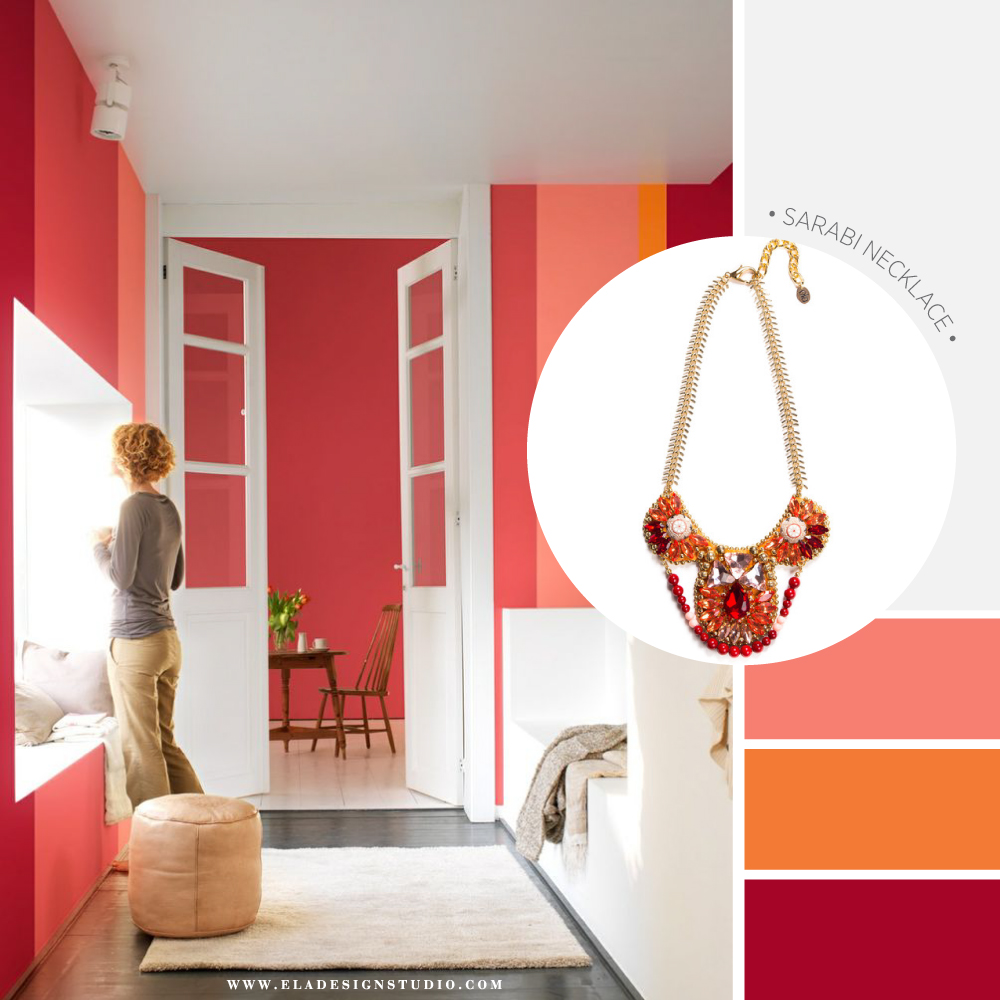
Photo Credits – Levis , lets colour collection | Shop The Sarabi Necklace HERE
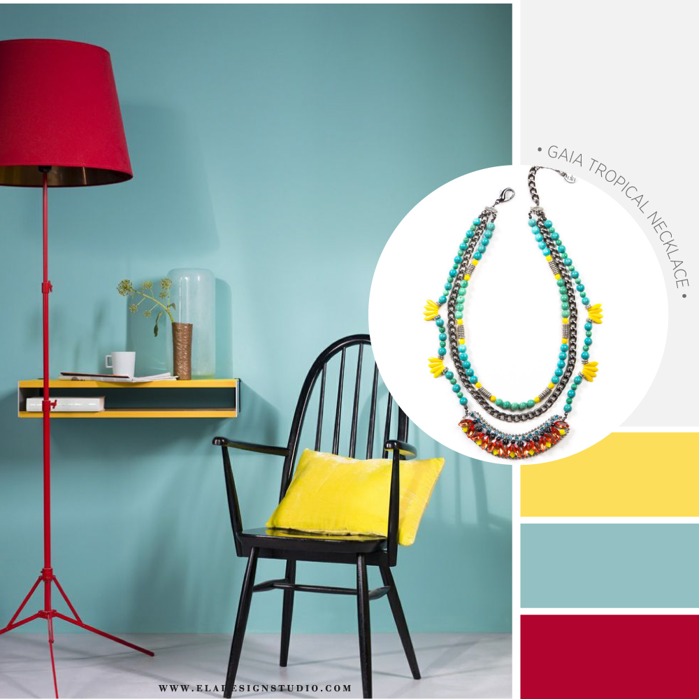
Photo Credits – Levis , lets colour collection | Shop the Gaia Tropical necklace HERE
Los colores caliente:
Rojo: Asociado con la pasión, el calor y la energía. Este color es muy audaz en su forma pura. Puede ser muy elegante y añade un montón de carácter a una combinación de colores – tanto tradicionales como contemporáneas. Es un gran acento a la familia verde que se encuentra opuesto en la rueda de color. Incluso en su tono más suave de color rosa, el rojo puede agregar mucho carácter a un esquema de diseño
Naranja: asociado con la vitalidad, la actividad y la aventura. Se cree que tiene cualidades de sanación y ayuda el sistema inmunológico. ¡Cuidado! Todo esto es cuando se utiliza en su forma más moderada por que puede resultar abrumador. Aunque el Naranja puro tambien puede funcionar en un entorno contemporáneo.
Amarillo: asociado con la alegría y la luz del sol. En su forma pura amarilla puede ser agotador, tal vez por que requiere mucho esfuerzo visual para procesarlo. Sus tonos más claros, sin embargo, pueden verse limpio y refrescante. Un acento de color, amarillo puede proporcionar un “twist” interesante en el espacio.
The Warm colors:
Red: associated with passion, heat and energy. This color is very bold in its pure form. It can be very elegant and add a lot of character to a color scheme – both traditional and contemporary. It’s a great accent to the green family which lies opposite red on the color wheel. Even in its softer tint of pink, red can add much character to a design scheme
Orange: associated with vitality, activity and adventure in color psychology. It is believed to have healing qualities and is supportive of the immune system. When used in its more muted shade it can be less overwhelming. Terracotta flooring, apricot fabrics or other muted varieties of this hue can be quite pleasing to the eye. Pure orange may work well in a contemporary setting but often doesn’t sit well in a traditional one where a more muted form works better.
Yellow: associated with cheerfulness and sunshine. In its pure form yellow can be overwhelming. Perhaps this is because it requires the most complex visual processing by our eyes. Its lighter tints, however, can look clean and fresh. As an accent color, yellow can provide a nice level of pop in a design scheme.
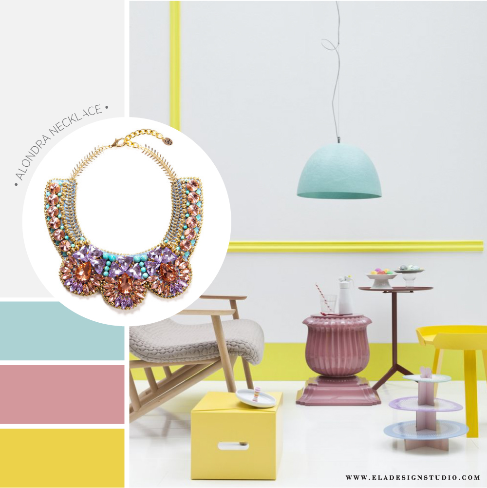
Photo Credits – Studio Beppe | Shop The Alondra Necklace HERE
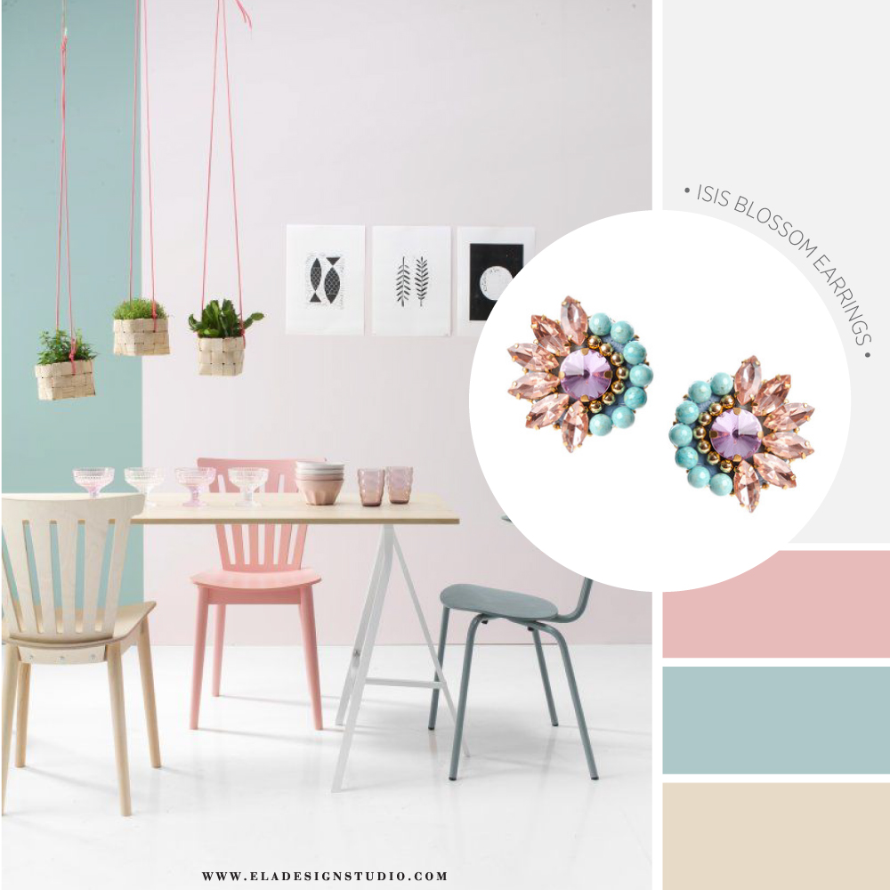
Photo Credits – Studio Pepe | Shop the Isis Blossom Earrings HERE
Los colores fríos
Violeta: asociado con la tranquilidad, la opulencia y la moda. Debido a su posición en la rueda de colores cálidos y fríos, puede determinar un gran grado de frescura a su hogar..
Rosa: el rosa es un color muy relajante y reconfortante. Varios tonos de rosa pueden reducir la agresión, promover la calma y la comodidad.
Azul: asociado a la calma, la confianza y la sensibilidad. Es el color favorito de millones de personas. El azul puede ser fácilmente emparejado con muchos otros colores, por lo que es una opción común en un esquema de color.
Verde: asociado con la naturaleza, la relajación y el descanso. El verde es muy versátil para trabajar con otros colores. Puede ser fuerte y tradicional y no se luce ta bien en ambientes contemporáneos.
Además de la temperatura del color, el valor tonal juega un papel importante en el diseño de interiores. Los tonos más claros son más reflexivos y como resultado vemos los objetos lejos. Como pueden ver en el tercer set estos tonos dan la ilusión de mucho espacio. Por otro lado, los tonos oscuros reflejan menos luz, esto crea la emisión del espacio cercano y más íntimo.
No olvides de tomar todo esto en cuenta la próxima vez que vallas a renovar tu hogar! ¡Hasta la próxima!
Escrito por: Eillen Beato – Her Eclectic Interior
The cool colors
Purple: associated with tranquility, opulence and fashion in interior design color psychology. Because of its position on the color wheel where warm and cool meet, its bias towards red or blue will determine its degree of coolness. With red undertones it takes on warmer characteristics than when the undertones lean more toward blue. Some tones of violet can be quite intense, but pastel lavenders can give a very fresh, uplifting feel to a room.
Pink: Pink is a very soothing and comforting shade. Various shades of pink reduce aggression and promote calmness and comfort.
Blue: associated with calm, trust and sensitivity. It is the favorite color of millions of people. Blue can easily be paired with many other colors and is therefore a common choice in a color scheme.
Green: associated with nature, relaxation and rest. Green is very versatile in working with other colors as it is in nature. It can be strongly traditional in feel or even a bit contemporary, as in the case of its more acidic forms. When designing, consider using a splash of red from the opposite side of the color wheel to create a dramatic accent for a green-based color scheme.
In addition to color temperature, the tonal value plays an important role in interior design. The lighter tones are more reflective and as a result we see these as moving away from us. You can in the third picture that these tones give the illusion of more space.
On the other hand, deeper, darker color tones reflect less light and appear closer to us. This creates the send of close and more intimate space.
That’s is all for now, keep these tip in mind next time you renovate your home, until next time!
Written by: Eileen Beato – Her Eclectic Interior